
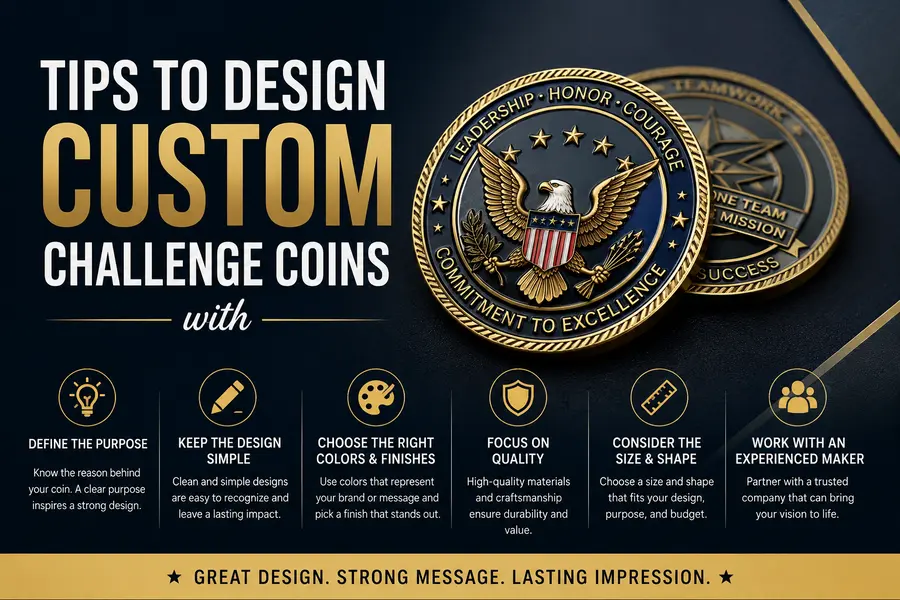
Tips To Design Custom Challenge Coins
A challenge coin is tiny. But what it stands for is something bigger.
Hard work is often represented by that little disc of metal. Pride is held in it, achievements are marked by it and memories are kept alive through it long after the moment has gone. Because of this, more thought is usually given to the design than it often receives.
A lot of coins end up looking the same, mostly because common templates get copied without much thought put into them. The shape, colors, artwork, finish, text and small details are noticed. These things can change how a coin looks and feels when it is held. When careful choices are made, something that brings pride is created and kept for years.
Memorable design doesn’t have to be complicated. By making a few smart choices at the beginning, you can make the whole project look more important.
A Coin Small Enough to Fit in a Pocket, Big Enough to Hold a Whole Story
Figure Out the Purpose First
Colors, finishes, and artwork should never be picked before the purpose is nailed down. Every design that actually works starts with a clear reason behind it.
A few questions are worth asking early:
- Is this coin being made for a sports team?
- Are employees being recognized through it?
- Is a charity event being marked?
- Is a milestone being celebrated?
- Is it meant to be a collectible?
Once the purpose is clear, everything else falls into place a lot faster. Putting too many ideas on one coin can make it look messy. Simple designs, on the other hand, tend to be remembered a lot longer.
Less Clutter, More Impact
Space on a challenge coin is limited. Every single detail included should actually earn its spot.
A common mistake made by first-time designers is trying to squeeze large blocks of text, multiple logos, and several graphics onto both sides of the coin.
Focus should be placed only on what matters most. A clean layout lets each detail stand out the way it’s supposed to. Good spacing matters just as much as good artwork here. If a design already looks busy on a screen, it’s going to look even busier once it’s stamped into metal.
Pick Colors That Actually Work Together
Color is usually the first thing noticed. A well-balanced palette gives a coin a professional look without making it feel overdone.
Brand colors are often chosen by organizations for exactly this reason, since a stronger visual identity gets created that way. If no brand colors exist, the palette should just be kept simple. You usually only need two or three main colors to do the job.
Using too many bright colors can make a design look messy, especially on small coins. High contrast between the background and the lettering also makes everything easier to read at a glance.
The Shape Says More Than People Think
Round coins are still the most popular pick, but they’re far from the only option anymore. Coins today can be different shapes, like:
- Shield
- Star
- Badge
- Dog tag
- Hexagon
- Custom outline
The shape chosen should match the message, not just look different for the sake of it. A badge shape might be picked by a fire department. Something more dynamic might be preferred by a sports team. A classic round coin might suit a company marking an anniversary far better than anything flashy. Sometimes, the simplest option leaves the strongest impression.
Finish Changes Everything
How light reflects off a coin, and how the whole thing appears, is shaped almost entirely by the finish. Some popular choices include:
Antique gold | Antique silver | Bright gold | Bright silver | Black nickel | Copper | Dual plating
A timeless look is usually created by an antique finish. A cleaner, more modern feel is delivered by bright plating instead. The right pick really comes down to the style being aimed for. Military and commemorative coins still lean toward antique finishes often, mainly because fine details get highlighted so well by them.
Attention to small finishing details is equally important when creating custom pins, as even minor design choices can improve the overall appearance.
Don’t Forget the Edge
The front and back tend to get all the attention, while the edge gets completely overlooked. It might seem like a minor detail, but the overall look of the finished piece can be changed quite a bit by it.
A few popular edge styles include: Rope edge | Diamond cut | Flat edge | Oblique edge | Spur edge
Each style brings its own look and feel to the table. A traditional appearance is given by a rope edge, while light gets reflected and extra detail gets added without overcrowding the design by a diamond-cut edge. These finishing touches might seem small on paper, but they often make a coin feel far more premium in hand.
Meaning Beats Decoration Every Time
It’s easy to fill blank space with random extra graphics, but decoration should always support the story sitting behind the coin. Every symbol included should carry a purpose.
Instead of adding artwork just because there’s room for it, what actually represents the group, organization, or event should be considered. That might be:
- A landmark
- A mascot
- A national symbol
- A company icon
- A meaningful date
Details like these tend to make a coin far more memorable than decorative patterns ever could on their own.
Size Should Match the Purpose
A coin’s appearance, and how much detail can actually be packed in, are shaped a lot by its size. Larger coins offer more room for artwork, sure, but bigger isn’t always better. A coin that feels too heavy or bulky often ends up sitting in a drawer instead of being carried around.
Most custom challenge coins are made between 1.5 and 2 inches in diameter because that size provides enough space for clear artwork while remaining comfortable to hold. Before a size gets locked in, how the coin will actually be used should be considered. A presentation coin might be bigger and more detailed, while something meant for a giveaway is usually kept smaller and lighter. The goal should always be a balanced design, not one that’s just trying to fill every inch of space.
Always Review the Digital Proof
A digital proof should always be looked over carefully before production starts. This preview shows exactly how the finished coin is expected to turn out, and gives room for changes before manufacturing actually begins.
Checking these things before approving it will be worth it: Spelling | Dates | Logo position | Colors | Borders | Space between items
Even a tiny mistake can turn expensive fast once production is already underway. Reviewing the proof properly ends up saving both time and money down the line.
Mistakes Worth Avoiding
A lot of first drafts end up looking overcrowded, usually because too many ideas got squeezed onto one coin. Keeping things simple almost always produces a stronger result.
A few common slip-ups:
- Using too much text
- Choosing fonts that are far too small
- Adding graphics that don’t need to be there
- Mixing too many colors
- Ignoring spacing
- Skipping the proof check
If every part of a design is fighting for attention, nothing actually stands out in the end. A little empty space left here and there usually makes the important details easier to spot.
Quality Beats Quantity, Always
Using the cheapest materials to cut costs might seem like a good idea, but challenge coins are often kept for many years. A better finish lasts longer and looks more professional.
Strong materials, good plating and careful coloring help keep a coin looking nice even after years of use. When a coin is meant to celebrate something important, high quality is what people remember.
What’s Trending Right Now
Challenge coin designs have changed a lot over the years, but some styles have stayed popular. Currently, these trends are the most popular:
- Clean layouts
- Bold lettering
- Antique metal finishes
- Minimal color palettes
- 3D raised details
- Matte backgrounds
The same preference for simple and memorable designs can also be seen in Custom Hockey Pins Canada, where teams often choose clean layouts that stay meaningful long after the season ends.
FAQs
What makes a good challenge coin design?
A simple layout, meaningful artwork, balanced colors, and clear lettering. That combination almost always creates the strongest result.
What size works best for custom challenge coins?
It’s usually best to have a size that’s between 1.5 and 2 inches. That gives you enough space for artwork but isn’t too bulky to carry around easily.
Can challenge coins be made in custom shapes?
Yes. Beyond the classic round style, shield, star, badge, dog tag, and fully custom outlines can all be produced.
The Line Between a Good Coin and an Unforgettable One
Great challenge coins are not remembered for being larger or shinier than others. Instead, their significance comes from the memories they hold. When the design is clear, details are carefully considered and the finish is appropriate for its purpose, a valuable keepsake is created. Even years later, a well-made coin can trigger a memory with just one look. Before production is approved, the design should be reviewed one more time. A few extra minutes spent on this can turn a decent idea into something that will be carried, displayed, and talked about for years.

Steve Smith is an expert writer and industry contributor at CustomPin.ca, where he shares valuable insights about custom pins, promotional products, and branding solutions across Canada. Through his writing, Steve covers topics such as enamel pins, button badges, acrylic pins, and custom challenge coins, offering practical guidance on design choices, materials, and industry trends. His goal is to simplify the process for customers by providing helpful information that supports confident decision-making.